

Client work for blogger, LJK from Luscious Goodness.
"I want something really clean and classic that will be easy to customize for different posts and recipes. I like flowy lines and filigree, but nothing too busy."
About the Design
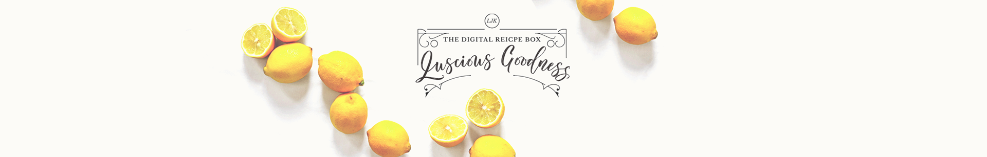
Curving shapes lend femininity to a highly symmetrical style, reminiscent of ornamental ironwork. Compatibility with the client's website was extremely important, so fonts and colors were chosen with her existing brand in mind.
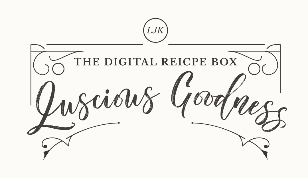
The main header is one of the only places a handwritten script font is used, which lightens the look and makes the home page friendlier. The client preferred to see her initials used as a signature, rather than designing a "Luscious Goodness" logo.
Graphics to be used on the blog and across social media are designed to be easily customized. A style guide was provided to the client for consistent quality.
RESOURCES
Fonts: Worthwhile Script by Joel Maker | Libre Baskerville by Impallari Type | Reborn Ornament by StoricType
Photography: Sliced Lemons by Lauren Mancke via Unsplash
Photography: Sliced Lemons by Lauren Mancke via Unsplash
Graphic design created in Photoshop
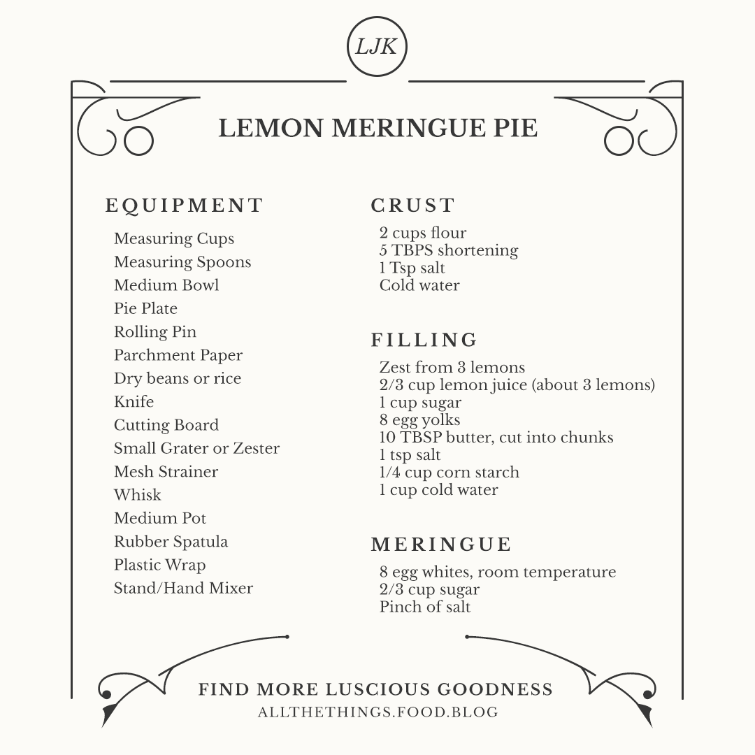
Recipe & equipment list for Lemon Meringue Pie by LJK at Luscious Goodness
Recipe & equipment list for Lemon Meringue Pie by LJK at Luscious Goodness

HIRE ME FOR YOUR NEXT CREATIVE PROJECT
visit BumbleBess.com for more info!